Nothing Phone (2a) Review Roundup: What Does the Community Think?
Nothing, the tech company known for its transparent design in both its phones and earbuds has just launched its third smartphone, the Nothing Phone (2a). This phone, coming in at $349 is marketed as a mid-range consumer smartphone. But how does it stand out, compare to other devices, and justify its position in a rather competitive price point?
Nothing Phone (2a) — Reviews
Reviewers have had differing takes on what this phone represents and where it stands in the market. Here’s what they had to say:
The Verge touched upon the feature set and the price point that Nothing had chosen, and how both of these could be (2a)’s strong suits.
…$349 is an extremely reasonable asking price. Sure, the outer frame and back panel are plastic, it’s only splash-resistant, and the Glyph Interface is still mostly a curiosity, but it’s only $349. It’s easier to understand why certain features like a more robust IP rating aren’t here.
That price tag also makes it easier to appreciate what is here: the Glyph Interface feels like a fun extra, and the informative always-on display is one of my favorites on any phone.
The Guardian also appreciated the price discrepancy between the (2a) and Nothing’s previous phones. It also talked about how this could be a great mid-range killer.
I’m in love with everything I see on paper with the Nothing Phone 2a, including how it retains the brand’s identity with its peculiar design and iconic Glyph Interface. In a sea of slates, its design is a refreshing one made better by the fact it’s under that $500 threshold of what most consumers deem as budget phones.
Frankly, the Google Pixel 7a and iPhone SE (2022) — two phones I’ve spent a great deal of time using as my daily drivers — should be afraid.
Engadget made a case for how Nothing Phone (2a) was more than just an ordinary midrange device.
Nothing also pays attention to small details like the phone’s crunchy pseudo-analog sound effects that help marry its distinctive design with its custom UX and dot-matrix-inspired widgets.
PCMag highlighted the other side on how the Glyphs did more harm than good.
I like the idea of the Glyph system since it encourages you to turn your phone over and focus on whoever or whatever is in front of you. But, in practice, I find Glyphs unnecessary and sometimes more distracting than a regular banner notification. You also have to remember what each notification pattern means for the system to be useful.
Ratings
Here’s how the reviewers rate Nothing’s first budget smartphone, the Nothing Phone (2a):
| PUBLICATION | RATING |
|---|---|
| WIRED (Review) | 9/10 |
| Android Police (Review) | 6.5/10 |
| PCMag (Review) | 3.5/5 |
| Engadget (Review) | 81/100 |
| 91Mobiles (Review) | 8/10 |
| DigitalTrends (Review) | 4/5 |
| The Guardian (Review) | 4/5 |
| Tom’s Guide (Review) | 4/5 |
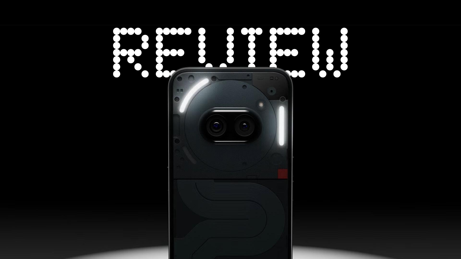
Videos
Here’s what some of YouTube’s top tech creators had to say about the phone.